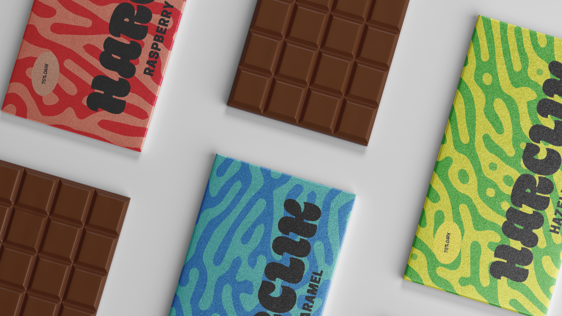
PACKAGING DESIGN
Bold Flavors Made To Fit Any Journey
HARCLIK / CONCEPT PROJECT
Branding, Copywriting, Type, Layout, Graphics
Harclik was launching their first set of chocolate bars and wanted to redefine the meaning of adventure. Their unique ingredients and flavors were inspired by their founders memories in Turkey before they moved to America to start a chocolate business.
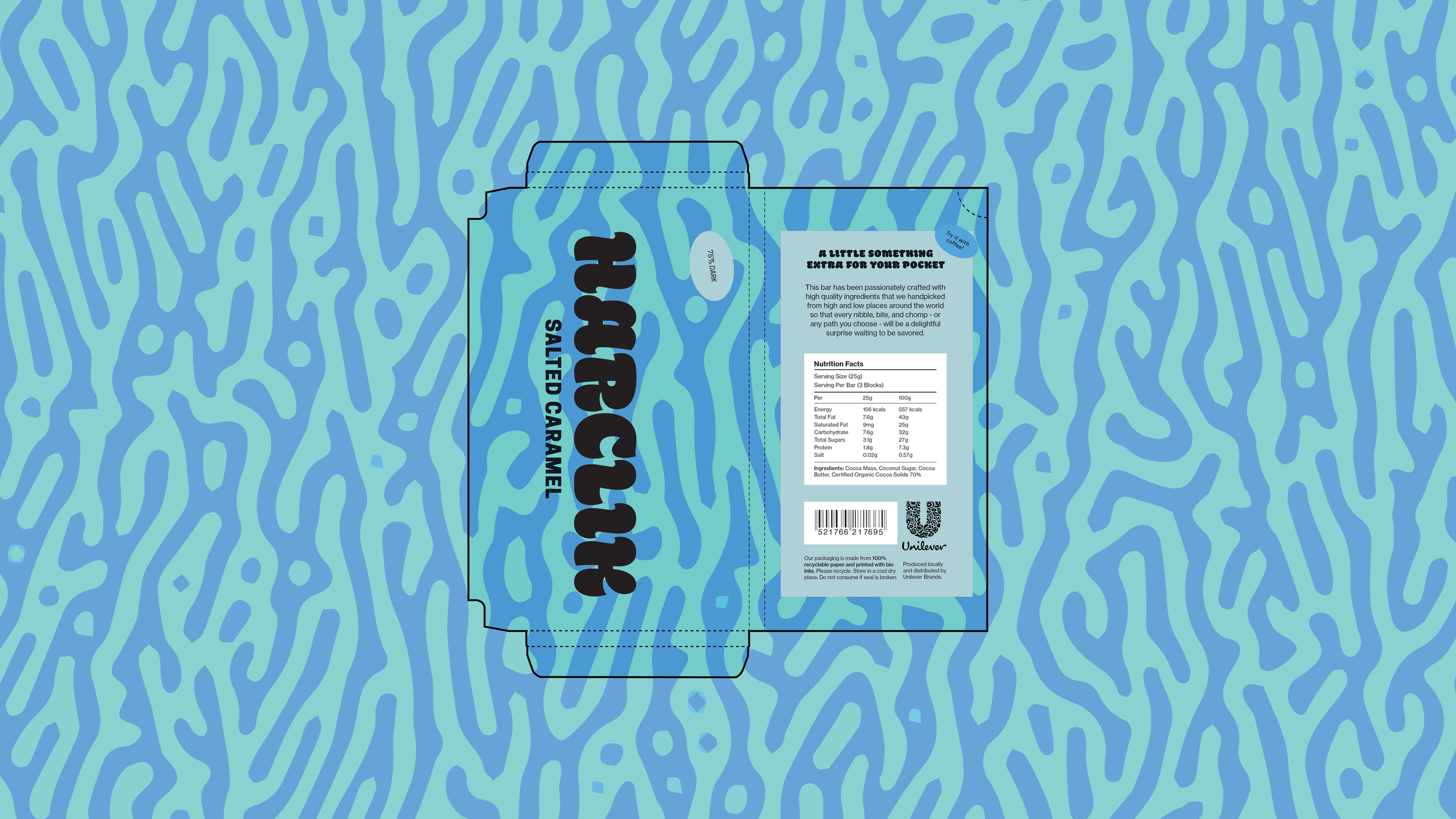
For adventurous eaters and risk takers, the name Harclik was inspired by the Turkish word for pocket money to good fortune on journeys. The packaging design uses a bold, playful primary typography and a graphic pattern that was inspired by the concept of morphogenesis, the biological process of organic patterns found in nature, to represent the beauty in different life paths. The pattern was manually generated using Photoshop.